
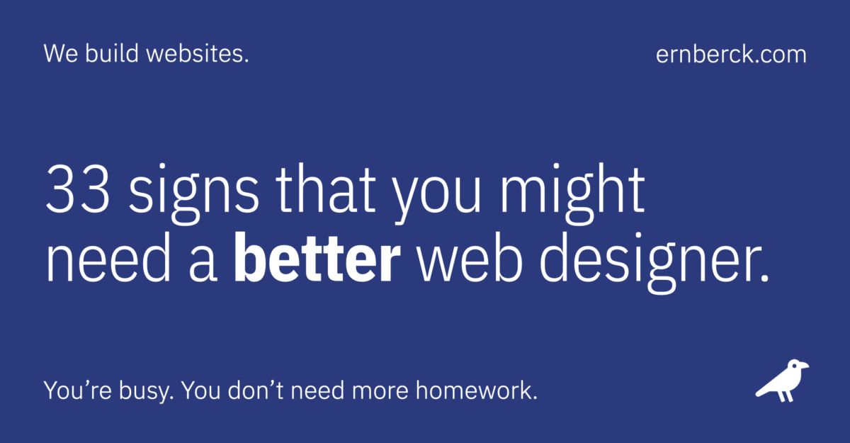
Do you need a better web designer? Not all cheap websites are bad, but if you’re not thrilled with the look or performance of your current website, this article might help explain why.
Is your website guilty?
If your livelihood depends on your online presence, then there are few things worse than a website that you’re embarrassed to share. If you suspect that your business site has a few of the problems listed here — or you’re afraid to look — just get in touch and we’d be happy to help.
33 signs that you might need a better web designer:
01. Button madness
It’s real trendy these days to stuff as many “free consultation” buttons on to your home page as possible. You can thank the fans of a wildly popular “storytelling” framework for this annoying fad.
According to them, your website visitors are clueless and have no idea of what they want to do. So you need to tell them — every 200 pixels or so — with big distracting buttons. These “experts” are wrong. Real designers don’t follow trends, they focus on objectives.
02. Missing site icon
A site icon (also called a favorite icon, favicon, or bookmark icon) is that dinky symbol — usually a logo device of some sort — that appears in a browser tab to identify the website you’re visiting.
If it’s absent, you’ll get a generic browser icon — Usually a little globe or something similar. This may seem trivial, but it can be a crucial usability factor when you’ve got 28 tabs open in Chrome. Little things matter.
03. You were charged by the page
Inexperienced web designers often charge by the number of pages because they know it makes intellectual sense to the client. But unless you need over 10 pages, require multiple unique layouts, or have an ecommerce website with dozens of products, it’s a lousy way to charge for a website. Making pages is usually pretty easy.
In our experience, even the simplest of websites should have the following 10 pages:
- Home
- About
- Contact
- Services
- Pricing
- FAQ
- Privacy policy
- Terms of use
- Accessibility statement
- Local site map
And none of these pages are hard to create or manage.
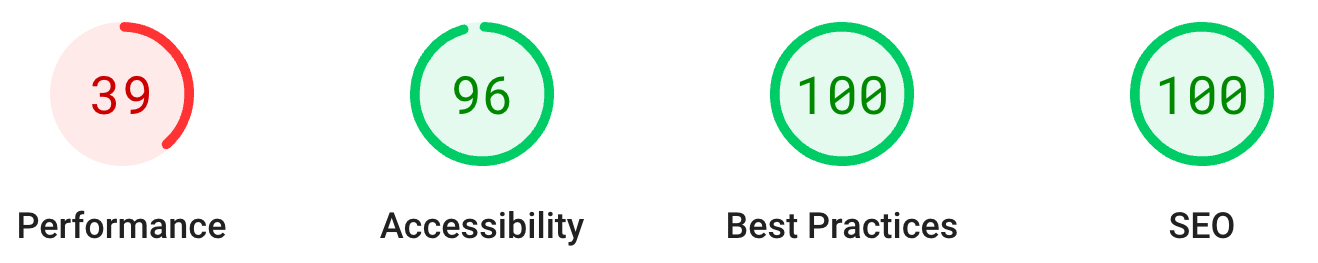
04. Your website is really slow
Nothing’s more annoying than a slow website. And page load speed is all about perception — If it seems slow, it is slow. And just so you know, cheap designers use cheap website hosting. And poorly built websites running on cheap hosts can be bang-your-head-on-the-desk slow.
If you think you may have a pokey website, visit Google’s PageSpeed Insights and enter your website’s URL. If your site racks up scores in the 40s or 50s on mobile, you could have a serious problem.
05. Poor accessibility practices
Over a billion people in the world (15%) experience some form of disability — Defined as any condition of the body or mind that makes it difficult to perform certain activities.
“Web accessibility” is the practice of making websites usable for all visitors, including those with disabilities, impairments, and limitations.
Accessibility compliance is a complicated topic and requirements are still being debated by government agencies. But still, any competent designer should be able to make a website easier to use for most visitors by including:
- Semantic HTML (code) structure
- Scalable typography
- Adherence to WCAG AA color contrast ratio standards
- Keyboard navigation
Learn more: Website accessibility guide
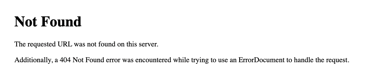
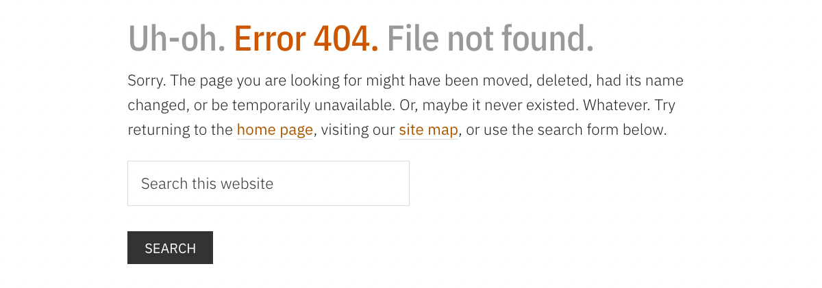
06. Useless error page
Stuff happens. Pages get deleted and lost. Links change, so old ones don’t work. But nothing screams “amateur” louder than a standard 404 (file not found) error page. At the very least, this page should clarify why you’re looking at it, and have a link to your home page. Maybe add a bit of humor. You don’t need to be Rodney Dangerfield, just try to be helpful. The better error pages have a search box; some even include a site map.
07. Connection not secure
When viewing your website, if you see “http” in your browser’s address bar instead of “https,” it means your website isn’t secure. Web page requests and responses that your browser sends over an unsecure connection can be intercepted, read, redirected, and modified. Or much worse. This is essential stuff, and search engines might penalize you for being irresponsible. So will your visitors.
08. Your designer is certified
I always catch a lot of grief for saying this, but here goes: Unless you perform surgery on humans, manufacture devices that run on high-voltage electricity, or work on BMWs, I couldn’t care less if you’re “certified.”
To be perfectly clear, there’s no such thing as an official certification or license for graphic design, web design, website hosting, digital marketing, search engine optimization, or social media management. None. I wish there was.
Take a look at your designer’s website. Anybody can put an official-looking badge or seal in their website footer and claim that they’re preferred, approved, certified, verified, award-winning, best of the year, or whatever. Spare me, nobody cares.

09. Overly cute navigation
This refers to the meaningless navigation elements we’ve all encountered on poorly designed websites. You know, links with dopey names like:
- My Journey
- Getting Real
- Experience Me
- Believing
- Up Level
Or, our three all-time favorites:
- Happy Places
- Secret Sauce
- Learnings
If your website has menu items like this and it was your idea, stop it. If not, you need to have a chat with your designer. Is “learnings” even a word?
10. No disclosure pages
Does your website have the following pages (click for examples):
- Privacy policy (protects your visitors)
- Terms of use (protects your business)
- Accessibility statement (informs those with disabilities)
It should. The FTC prefers them, Google looks for them, and your lawyer — if you’ve got one — would insist upon them. Plus, if you collect any personal information (and you most likely do), the law often requires it. Besides, there’s no shortage of free templates available to help get you started.
11. Your content is dreadful
A good designer won’t let you fill your website with crappy content. Bad designers don’t care — They figure content is your responsibility, not theirs. I’ve actually heard web designers proclaim “We don’t do content.” Really? That’s like Ferrari saying “We don’t do engines.” I’ve got some news for you: A cool design is nice, but folks show up for the content. And the best designers will help you create it.
Learn more: Content marketing still works
12. Exposed code
Have you ever come across a web page on your website with some cryptic looking gibberish at the top? Or maybe a block of almost-intelligible text and symbols? How about a word or phrase wrapped in square brackets? If so, that’s probably raw code exposed on the front-end of your website for the whole world to see. It shouldn’t be there — Something broke and nobody cares.
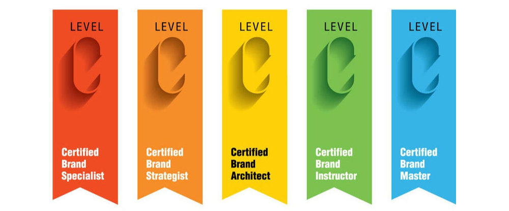
13. Your designer is also a brand strategist
At some point in the recent past, every stay-at-home mom with a Canva account became a “brand strategist.” Most likely because it’s a vague enough title, sounds impressive, and the barrier to entry is nonexistent.
If you’re offered this service by a web designer — especially for a fee — pass on it. Real brand strategists have decades of experience and charge a fortune for their expertise. You should skip the “brand storytelling” nonsense too. You’re building a website, not writing a memoir.
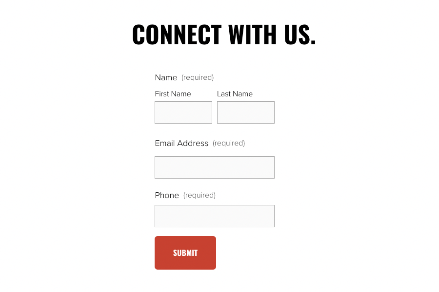
14. Broken contact forms
If you want to generate leads, you’ll probably have at least one contact form on your website. If you do, try to answer the following questions:
- Are you receiving all contact form email notifications from your website?
- How would you even know?
- Is this contact form data also stored on your server?
- Do you regularly test your form processor?
- Are you using domain-based email to send transactional notices?
- If so, have you enabled SPF, DKIM, and DMARC?
- Do you have any idea what I’m talking about?
Online forms look simple, but they’re immensely complicated and need to be tested frequently (like once a month). Screw this up and you’re toast.
15. Sloppy design
A lot of people think that design is purely subjective but — just like any creative discipline — web design has its rules. Layout, navigation, content, and visuals should all work together to make sure your website is useful and usable.
So, how do you approach the foundations of good website design? A logical place to start are the seven golden rules of layout design (sometimes referred to as the “Gestalt principles”):
- Negative space
- Proximity
- Repetition
- Contrast
- Alignment
- Focal points
- Hierarchy
Bottom line: If you show your website to your neighbor and her response is: “Oh, wow … umm … yeah, that’s awesome,” it probably needs work.
16. No site-wide search
I can’t think of anything more fundamental than being able to find stuff on a website. Admittedly, most website search widgets aren’t weapons-grade, but they usually return reasonable results and are easy enough to implement on most modern websites (take a look at our footer at the bottom of the page). At the very least, you should have some sort of public site map (archive) page.

Jeffrey Zeldman
“Good information architecture enables people to find and do what they came for. Great information architecture takes ‘find’ out of the equation: the site behaves as the visitor expects. Poor information architecture neuters content, design, and programming — And devalues the site. It’s like a film with no director.”

17. Undated blog posts
Everybody’s in a rush to share permanent and authoritative content. Blog publishers and internet marketers like to call this “evergreen” content, because they think that their wisdom is timeless — That their content never needs to be revised or updated.
That’s rubbish. There’s nothing worse than wading through a lengthy online technical article, just to discover that it was written 12 years ago and is now totally irrelevant. Undated website articles are a clear sign of a misinformed amateur. If your designer suggested that you omit publication dates, fire them.
18. Looks funky on mobile
Responsive design is a methodology for creating websites that provide a useful user experience, regardless of the viewing device. Your website should be as easy-to-use on a smartphone as it is on a desktop computer.
This design technology has been around for over 10 years, and is pretty much a standard feature of any new website. If you find yourself working with a designer who disagrees, find another designer.

19. Revolving sliders and carousels
Ugh. These are the marching blocks of text or pictures that move, rotate, slide, or fade so unpredictably that you couldn’t possibly engage with them. If used properly they can work well for art and photography portfolios, but that’s about it. Sliders are mostly implemented by lazy amateur designers who don’t understand user experience, or are too scared to tell the client that they’re a dumb idea.
20. No FAQ page
Visitors like them. Google loves them. They’re easy to build and manage. There’s no reason not to have a page of frequently asked questions. This is simply the who, what, why, when, where, and how of your business. Just put all the answers in a list and stick it on a page called FAQ. Pretty basic stuff.
21. Crummy website host
If your “affordable” web designer included hosting in your deal, she’s likely charging you $20 a month for a white label service (see #28) that she pays $2 for. A nice profit for her, an unreliable mess for you. Talented designers understand that building a website isn’t the end — It’s just the beginning. Scalable and dependable online marketing tools require robust hosting.
22. DNS errors
The internet’s domain name system (DNS) is a vast distributed directory that translates human-friendly domain names (like ernberck.com) into arcane network address locations (like 104.196.197.161).
DNS used to be pretty easy to manage and configure, but now it’s mostly voodoo. You may not think that this stuff falls within the purview of a web designer, but it does. If all versions of your root domain don’t converge on a single point of truth (your “canonical” name), somebody screwed up.
23. Your designer used a page builder
A “page builder” is a plugin or component of a website theme (typically WordPress) that lets you layout pages with minimal effort and time. Page builders are very powerful and often replace the entire core editing system.
Unfortunately, an over-reliance on them can make designers lazy and careless. This leads to bloated, unnecessary code that’s difficult to maintain, fix, or migrate. In other words, it’s too easy to “design” stuff without really knowing what you’re doing.
Page builders have also drastically lowered the barrier to entry in the web design field. Anybody can drag and drop, but few can diagnose and fix. Consider yourself forewarned: Page builders can be evil.

24. Zero documentation
Good web developers understand that someone else may need to interpret their work later. So they take a lot of notes. I’m not talking about scribbles on a Post-it Note. I’m talking about clear, concise, thorough comments that document their code and design decisions. They do this out of habit — And respect for the client.
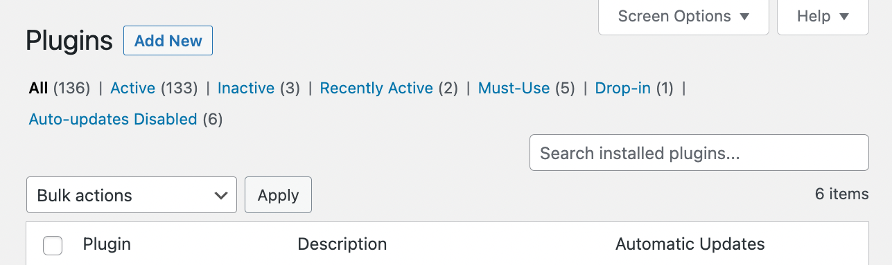
25. Too many plugins
A “plugin” is a helper application that supplies additional features to the core software. Most content management systems, such as WordPress, depend on them for advanced functionality. Frequently, plugins don’t play well together and conflicts arise, causing website crashes and weird behavior.
Conventional wisdom suggests that you should keep the number of plugins to 10 or fewer, but never more than 20. I’ve seen WordPress installations with over 100 active plugins — A disaster that already happened.
26. Three eggs, one basket
One of the biggest mistakes business owners make is having their web hosting, domain registration, and email service all provided by one source (frequently the web designer). Intuitively, this kind of makes sense — Fewer vendors to deal with and less of a headache for you.
Why is this such a bad idea? If your relationship with the designer goes south (and it eventually will), it’ll be painful to move all three critical services someplace else. However, if you’re using three different providers and one goes bad, that’s much less of a problem: Just fire the cranky part and go elsewhere.
Learn more: The bus factor
27. Your designer’s website sucks
This should be self-evident, but often isn’t. If you visit a sign shop and they’ve got an ugly broken sign out front, or drive by a gardener’s house and all the plants are dead … Well, you get the drift.
Your web designer’s website should not only announce their services and availability for work, but also demonstrate their creative expertise, technical skills, and ability to communicate. If it doesn’t then look around some more.
28. White labeling
This is a little complicated, so bear with me. A “white label” product or service is a commodity created by one company, that sells it to other companies, who in turn rebrand it to make it appear as if they had made it themselves. There’s nothing inherently wrong with this practice as long as it’s divulged to the client. Unfortunately, it rarely is.
Some web design agencies outsource everything: Hosting, code, design, copywriting, SEO, and support. You wonder what they actually do themselves. These people don’t create anything of value, and they don’t know how to fix anything. They’re just assemblers. Steer clear of them.
Learn more: The trouble with outsourcing
29. Gratuitous use of technology
Novice web designers love shiny technology — Products with cool names like Cloudflare, NitroPack, Bricks, LiteSpeed, GridPane, and Vultr. Sadly, most of these amateurs have no clue how to properly configure or leverage this machinery. They just sign you up on the free plan and click a few buttons based on the advice of some Facebook forum expert.
A few months later the head-scratching starts when images disappear, content revisions won’t load, pages redirect, and your email stops. Most small businesses have no need for content delivery networks, reverse proxies, edge caching, or CNAME flattening. What they do need is a solid and reliable website host.
30. Bloated or borrowed images
Big beautiful images can make or break a website. It’s almost cheating. But if they’re too big your site will slow to a crawl. And if you “borrowed” the images from someplace else, you could wind up in hot water. Just make sure your designer knows how to properly optimize your legally-obtained images and you’ll be fine.
31. Annoying popup boxes
There are few things more irritating than having a godawful message box pop up in your face the moment you land on a web page. Why on earth would anyone want to subscribe to your newsletter on their first visit to your website? They wouldn’t.
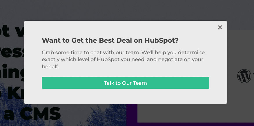
The same goes for webinar signups, review badges, and chat boxes. Let visitors get their bearings and explore your site a while before you start annoying them. Also, be aware that most search engines will impose a mobile popup penalty if you abuse this technique. There are much friendlier ways of getting a visitor’s attention. A good designer knows how.
Note: Is it popup, pop-up, or pop up. “Popup” is the most popular spelling for those annoying messages that assault you on websites. But, I think “pop-up” is probably more grammatically correct.
32. Wrong or missing Open Graph tags
Open Graph (OG) “tags” are snippets of code that control how URLs (website addresses) and featured images are displayed when your web pages are shared on social media. They’re part of the Facebook Open Graph protocol, and are also used by other social media sites, including Instagram, LinkedIn, and Twitter.
If you’ve ever seen a shared web page on Facebook with an odd image (or no image), that’s probably because of a missing or incorrect OG tag. There’s a lot of nuance to using these tags effectively, and if they’re not implemented properly your social media marketing could suffer.
In case you’re wondering, these are Open Graph tags:
<meta property="og:image" content="https://www.ernberck.com/wp-content/uploads/2023/01/berck-post-33-signs-that-you-might-need-a-better-web-designer-2048-1067.png" />
<meta property="og:image:width" content="2048" />
<meta property="og:image:height" content="1067" />
<meta property="og:image:alt" content="post 33 signs that you might need a better web designer" />
<meta property="og:locale" content="en_US" />
<meta property="og:type" content="article" />
<meta property="og:title" content="33 indicators of poor web design" />
<meta property="og:description" content="33 signs that you might need a better web designer. If you’re not thrilled with your current website, this might help explain why." />
<meta property="og:url" content="https://www.ernberck.com/33-signs/" />
<meta property="og:site_name" content="Ern Berck Digital" />
<meta property="og:updated_time" content="2023-05-06T16:50+00:00" />33. You hate your website
This is the granddaddy. Forget all the other stuff. Compared to this, the first 32 signs pale in comparison. I know a business owner who is so ashamed of his current website that he removed the web address from his business cards. Seriously.
Summary
This is by no means an exhaustive inventory of website flaws, nor is it an indictment of all inexpensive websites and those who sell them. Just think of it as a peek under the hood of a mediocre small-business website.
The problems that you’ll often discover are due to incompetence, poor design skills, and the incorrect use of technology. Greed and ignorance play a considerable part too. Fortunately, there are a lot of good web designers out there. The challenge, of course, is finding the right one for you.
Related
Revised: October 5, 2024 at 3:24:02 PM PDT
